ANNOUNCEMENT CATEGORIES
This article shows Users how to configure Announcement Categories in Fisikal.
ANNOUNCEMENT CATEGORIES OVERVIEW
Announcement Categories: a grouping mechanism for Announcements.
Users need to have Announcement Categories (ACs) in place in order to upload and manage content into Categories. When content is uploaded, it MUST be associated to an AC and also a TAG otherwise it will not be categorised or sub categorises so users can see it.
In the example below, ACs have been set up for individual months so that content can be associated to users over multiple months. The mechanism that actually delivers the content is called TIMELINE and will be covered later in this document.

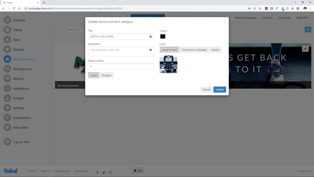
By selecting the pencil icon on an AC you will see the following attributes:

Users can create new ACs and edit existing ACs as required.
Imagery shown on the AC will be fed through the end users web platform or mobile application. Users should make sure that AC imagery renders well in its intended place (web / mobile).
NB: By selecting to DISABLE an AC, all associated content will not be shown for users.
Here is a screen shot of how content comes into an example mobile app for a user to view.


When a user selects an AC tile such as MONTH 4, they are then taken into that AC and shown an overview of this AC with associated TAGS.
An AC is only visible to a user if it has an ACTIVE Announcements that has been associated to this AC and that has been assigned to them for them to see. If they are utilising a TIMELINE, then ACs will only show at the specific time they should be viewed by the user.
A TAG is only visible to a user if it has an ACTIVE Announcements that has been associated to an ACTIVE AC and that has been assigned for them to see at that specific time.
ANNOUNCEMENT CATEGORY IMAGERY
ACs can be displayed in connected mobile Applications. Users should select an Announcement Category carefully making sure they have taken the following sizing information into consideration.
Mobile applications will render imagery according to the size of the imagery. It is recommended that full screen portrait imagery is cropped so that it is height 1334 px and width 750 px for optimal automatic in-app resizing.
When a 1334 x 750 image is cropped for an AC tile, it is cropped in the centre of the image at 330 px x 330 px as shown below:


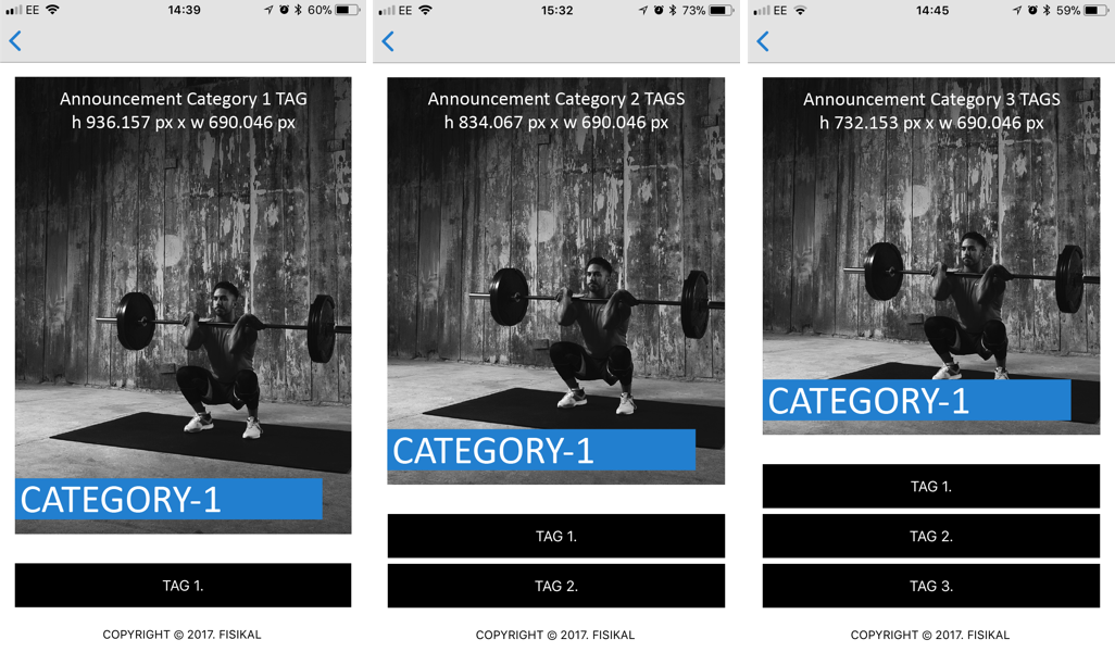
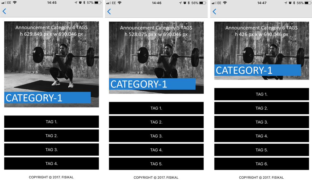
When the AC image is presented when the user selects the AC tile for the AC Overview page, the image is re-cropping from the original 1334 x 750 px imagery depending on the number of TAGS that have been associated to this specific AC. You can see the specific sizing of and re-cropping of the image outlined below.
Note that the centre of the image will remain the centre of the image and the cropping will be done on the height of the image.


It is not recommended that individual ACs have more than 6 TAGS associated to them as the imagery will shrink significantly.
AC title font size will also reduce when more text is added to a specific title. When the characters are too long, the title panels will stretch to 2 or 3 panels and the font size will reduce significantly. It is recommended that AC title are kept as short as possible and Users pay close attention to capitalisation to make sure branding is consistent.
![White Logo Blue Banner copy-100.jpg]](https://knowledge.fisikal.com/hs-fs/hubfs/White%20Logo%20Blue%20Banner%20copy-100.jpg?height=50&name=White%20Logo%20Blue%20Banner%20copy-100.jpg)